The design system behind Tata Neu's relaunch


Every colour on this screen is a role from the system. X-ray shows which one, read from the design file.
Tata Neu started on a design library built by an outside agency, and it could not carry a super app made of dozens of products. In May 2022 I started an in-house, token-based system, and I built most of it myself: the foundations, the token layer, the components and their documentation, the handoff file and the release checks. Design System 1.0 shipped in the July 2023 relaunch with more than 130 elements and more than 30 widget types. The same token layer later carried four brand modes and the app's move from a dark theme to a light one in March 2024.
The relaunch is the one where Tata Neu's Google Play rating rose from 3.8 to 4.2. Performance work shipped in the same release, so I don't credit the system alone.
- Role
- Senior Product Designer at Tata Digital, through Dew Solutions
- Years
- 2022 to 2025
- Scale
- 130+ elements, 30+ widget types and 20+ merchandising widgets in DS 1.0, built in 120+ days
- Tokens
- 300+ colour values under about 140 colour roles, in four brand modes, with Mobile and Desktop modes for spacing, radius, borders and type
- Team
- Me and one designer, with a dev lead and engineers. I reported to the Head of Design
- Platforms
- The Android and iOS apps and the web app (PWA)
- Tools
- Figma styles for 1.0, Figma variables from 2024, tokens kept in a Figma plugin and exported as JSON
Part I
Why
A super app is many products in one coat, and the agency library could not hold it together.
1. A super app is many products in one coat
When every product team ships its own buttons, an app that holds your money stops feeling like one place.
Tata Neu went public in April 2022. It is the Tata Group's super app: payments, shopping, travel, food, finance and loyalty behind one login. Each of those is close to a business of its own, with its own team, its own deadlines and its own idea of what a button should look like.
People notice when the seams show, even when they can't say what is wrong. A price set in a different weight on two screens, a card with a different corner, a button that sits lower than the last one. Each is small. Together they tell someone that the app they are trusting with their money was not made as one thing.
The app did not stop shipping while the system was built. Modules kept going out every release, so the system had to grow underneath a product people were already using.
- April 2022Launch, on the agency library
- May 2022In-house library started
- Early 2023DS 1.0 built for release 3.5
- May 2023Introduced
- July 2023Public relaunch
- Late 2023DS 1.1 with release 4.1
- March 2024Light theme in the refresh
- 2024Patterns and process review
- August 2025Team training
2. The library it replaced
The app launched on an agency's library, and it was built for a smaller app than Tata Neu became.
3. My part
I took the initiative, and I built most of the system myself.
One designer worked with me on the core team, with a dev lead and engineers who built the components in code. I reported to the Head of Design. Designers on the product teams built their features on the system and proposed new components to it, so the work splits three ways:
| I led | I co-built | I contributed to |
|---|---|---|
| The core library and its foundations, the tokens and variables, the brand modes, the widget rules, the system states, the handoff file, release QC, the move from dark to light, and the team training in 2025 | The Design Centre of Excellence structure that gave the system a governance council | The icon set and the illustration system |
Some exploration pages in the library carry other designers' names. Those are theirs, and this page doesn't claim them.
Part II
The system
Values, then roles, then components, with modes for brand, theme and screen size.
4. How it is put together
Values at the bottom, roles above them, components on the roles, and screens on the components. Nothing skips a layer.
The system had two files. The library held the foundations, the tokens and every component, ready for designers to use. The handoff file held the documentation developers read: each component's overview, specs and guidelines, the foundations with their token names, and a changelog. The handoff file's cover said "Ready for dev", and that was its whole job.
Inside, the layers stack in one direction:
- Values. The raw palette, more than 300 colours in tonal steps, plus the spacing, radius, border and type scales.
- Roles. About 140 colour roles, each named for its job:
primary,on-primary,surface,on-surface-high-contrast. Roles are where modes live, so one role can hold a different value per brand, per theme and per screen size. - Atoms and molecules. Buttons, chips, inputs, tabs, toasts, then lists, cards and sheets built from them.
- Widgets. The blocks a store page is made of: banners, carousels, grids, the payment ribbon.
- Screens. Every module, built from widgets.
- ScreensEvery module, built from widgets
HomepageStoriesNeuPassOffer Zone - WidgetsThe blocks a store page is made of
hero bannercarouselgridpayment ribbon - Atoms and moleculesComponents and the parts built from them
buttonchipinputtabslistcardbottom sheet - RolesAbout 140 colour roles, named for their job. Modes live here
primaryon-primarysurfaceon-surface-high-contrast - ValuesMore than 300 colours in tonal steps, and the spacing, radius, border and type scales
#8800ECspacing-16border-radius/small
5. Foundations
Eight foundations, each written down with its token names: colour, type, spacing, sizing, borders, elevation, opacity and layout.
Type
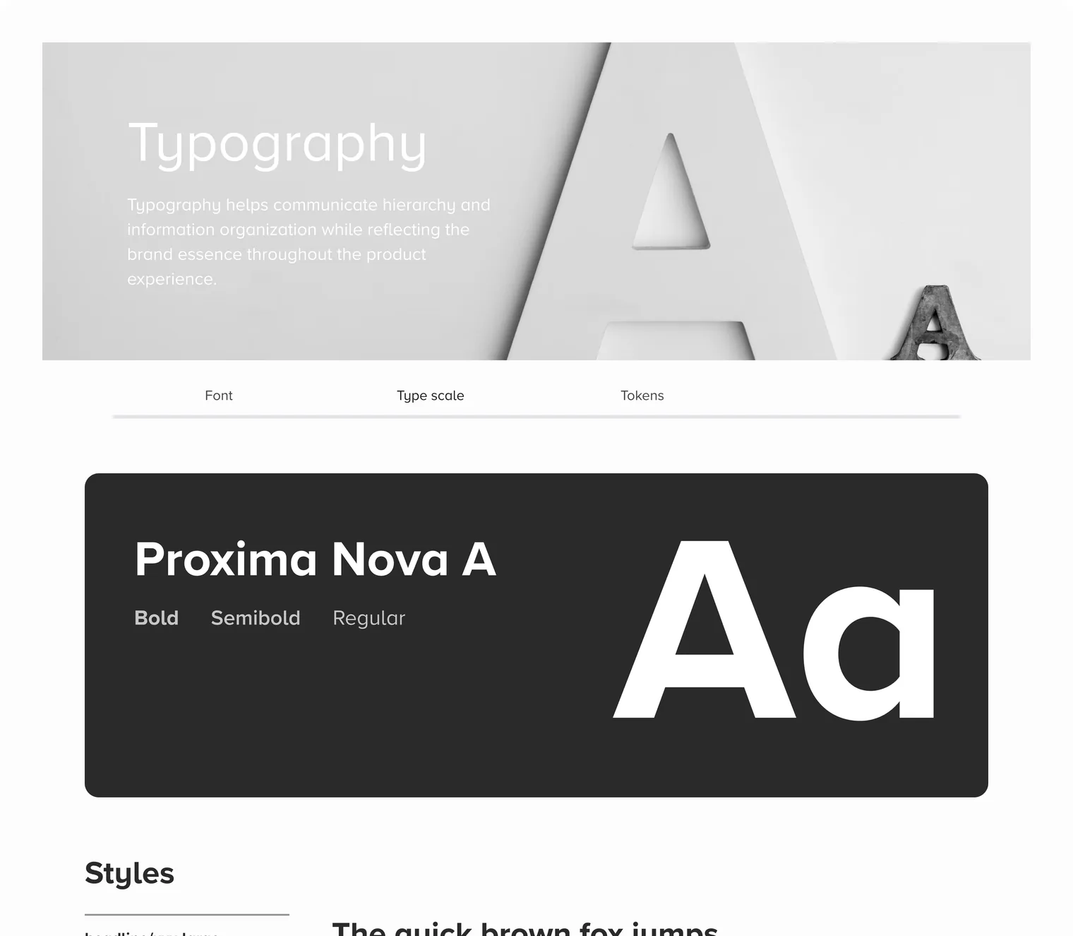
One family, Proxima Nova, in three weights, on a scale named for use rather than size: headline, title, body, label, caption. Each step pairs a size with a line height, from 36 on 44 for the largest headline down to 12 on 16 for labels. On desktop every step grows: the largest headline moves from 36 to 40, body text from 16 to 18.
Spacing, radius and borders
Spacing runs on a scale from 0 to 80. On desktop most steps grow by four pixels, so 16 becomes 20 and 32 becomes 36, and the smallest steps double. Corners have their own scale from none to fully round, and borders come in four widths. A designer picks spacing-16 or border-radius/normal, never a number.
Spacing
spacing-22spacing-34spacing-88spacing-1212spacing-1616spacing-2424spacing-3232spacing-4848spacing-6464spacing-8080Type
headline-1Aa36 pxheadline-2Aa32 pxheadline-3Aa28 pxtitle-1Aa24 pxtitle-2Aa20 pxbody-1Aa18 pxbody-2Aa16 pxbody-3Aa14 pxlabel-1Aa12 pxcaption-1Aa10 pxColour
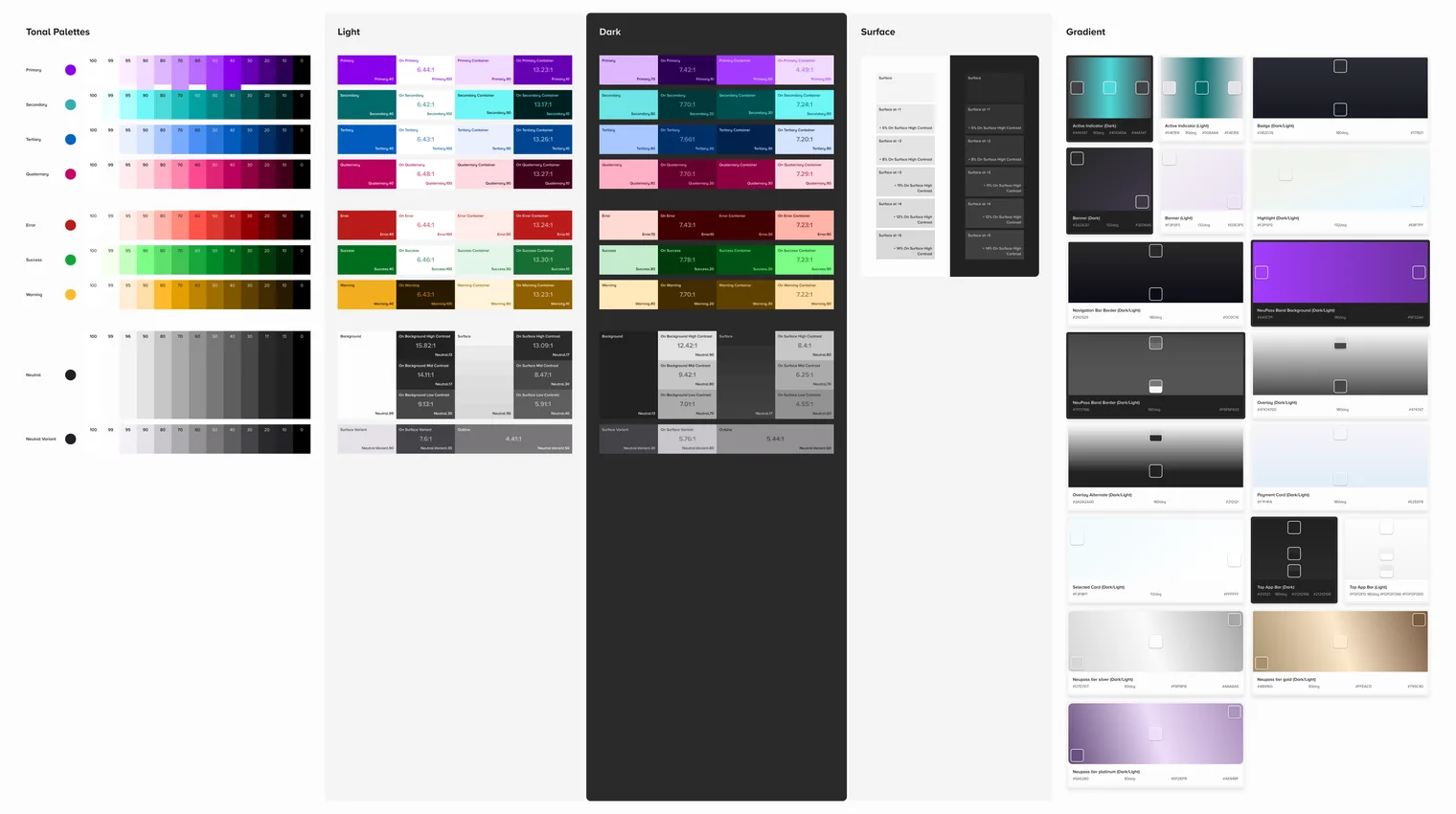
The app needed colour that would survive a second theme and many brands without anyone checking contrast by hand on every screen.
Material 3, Google's design system, names colours by their job rather than their shade. There is a primary colour, a colour made to sit on primary, a softer container, and a colour made to sit on that container. The main jobs come in pairs, so text is designed against the background it will sit on, and each pair can be checked for contrast.
I built Neu's colour on those roles on purpose. Our engineers already knew them, so the roles needed little explaining at handoff. And the paired roles and tonal steps turned a second theme and contrast checking into a system instead of a judgement call on each screen.
What it cost. The roles had to stretch to fit Neu. We needed a fourth accent, so we added quaternary, with its own on-colour and container like the other three. Text came in three strengths, high, mid and low contrast, so a price and its small print could each be checked. NeuPass, the app's membership programme, got a container and an on-colour for each of its four tiers, from Explorer to Legend. Gradients and a theme for the IPL cricket season sat on top.
How we knew it worked. The palette docs carried a contrast ratio beside each solid colour pair, and Design System 1.0 fixed contrast against WCAG, the web's accessibility standard. When the app moved to a light theme in March 2024, it moved on the same roles.
This is where a design system decides who a product is for. A contrast ratio is a decision about whether someone with weak eyesight can read the price.
Wireless earbuds
₹2,499
Add to carton-backgroundonbackground- 17.11:1#1A1A1A on #FDFDFD
on-primaryonprimary- 6.44:1#FFFFFF on #8800EC
on-primary-containeronprimary-container- 8.26:1#6700B5 on #FBECFF
6. Tokens and variables
A colour is chosen once, named for its job, and every component asks for the job. That is the whole idea, and it took two years to do properly.
I had three ways forward: keep patching the agency library, adopt an off-the-shelf system as it came, or build our own with a token layer under every component.
I chose tokens. A token is a value with a name that says what it is for, such as a colour called surface. It is defined once, and every component that asks for surface gets the same value, so a change in one place reaches every screen built on the token.
Tokens had two tiers, values and roles, and components used the roles directly. I kept the tokens in a Figma plugin and exported them as JSON for the developers, who mapped them into the apps. Design and code used the same names for the same values, which is most of what keeps them from drifting apart.
- Component
button / filled / large- Part
- Role
- Neu light
- Neu dark
- Croma, BigBasket
,
"border-radius": {
  "none":    { "value": "0",   "type": "borderRadius" },
  "small":   { "value": "4",   "type": "borderRadius" },
  "normal":  { "value": "8",   "type": "borderRadius" },
  "medium":  { "value": "16",  "type": "borderRadius" },
  "full":    { "value": "50%", "type": "borderRadius" }
},
"body": {
  "small-regular": {
    "value": {
      "fontFamily": "{font-family.proxima-nova-a}",
      "fontWeight": "{font-weight.regular}",
      "fontSize":   "{font-size.16}",
      "lineHeight": "{line-height.24}"
    },
    "type": "typography"
  }
}From styles to variables
Design System 1.0 ran on Figma styles, because Figma's variables did not exist yet. When they arrived, we trialled them on the homepage in January 2024 before moving the library. Variables can hold modes, so a whole frame can switch theme or screen size at once, which styles cannot.
A variable only helps if it is used the right way, so the library carried a short guide for designers. Link the whole frame or each section to a theme, not every element, because linking each element defeats the point. Build backgrounds from frames, not loose shapes, because what sits inside a shape won't follow its theme. Replace styles with variables across the whole screen, not halfway.
What it cost. More than 120 days to build 1.0. Modules kept shipping on the old library the whole time, so for months the app carried two systems side by side.
How we knew it worked. By the July 2023 relaunch the system held more than 130 elements and more than 30 widget types. Every module redesign after that was built on it, from the homepage and the menu to stories, NeuPass, chat and offers.
7. One layer, many brands
Croma's green and Neu's purple are the same role with a different value. That is what let one library serve the Tata brands inside the app.
Tata Neu carries other Tata brands inside it, each with its own colour. The first answer was a copy of the library per brand, for Croma, Tata CLiQ, ONDC and travel. Copies drift: a fix in one never reaches the others.
So brand became a mode on the role layer. The library's semantic collection holds four modes: Neu dark, Neu light, Croma light and BigBasket. A component asks for primary and gets Neu's purple, Croma's green or BigBasket's darker green, depending on where it sits. Screen size works the same way: spacing, radius, borders and type each have a Mobile and a Desktop mode, so the web app gets its larger steps without a second set of components.
primary- #8800EC
on-primary- #FFFFFF
primary-container- #FBECFF
on-primary-container- #6700B5
background- #FDFDFD
on-background-high-contrast- #1A1A1A
outline- #78787D
What it cost. Every new role had to be given a value in every mode, or a brand quietly fell back to Neu's colours. The variable guide existed partly to catch that.
How we knew it worked. Food delivery on ONDC, the omnichannel fashion module, the BigBasket integration and the seasonal IPL work were all built on this one library.
Part III
The library
Every component written up three ways, plus widgets and the states nobody plans.
8. Components and their documentation
Every component was written up three ways: what it is for, exactly how it is built, and when not to use it.
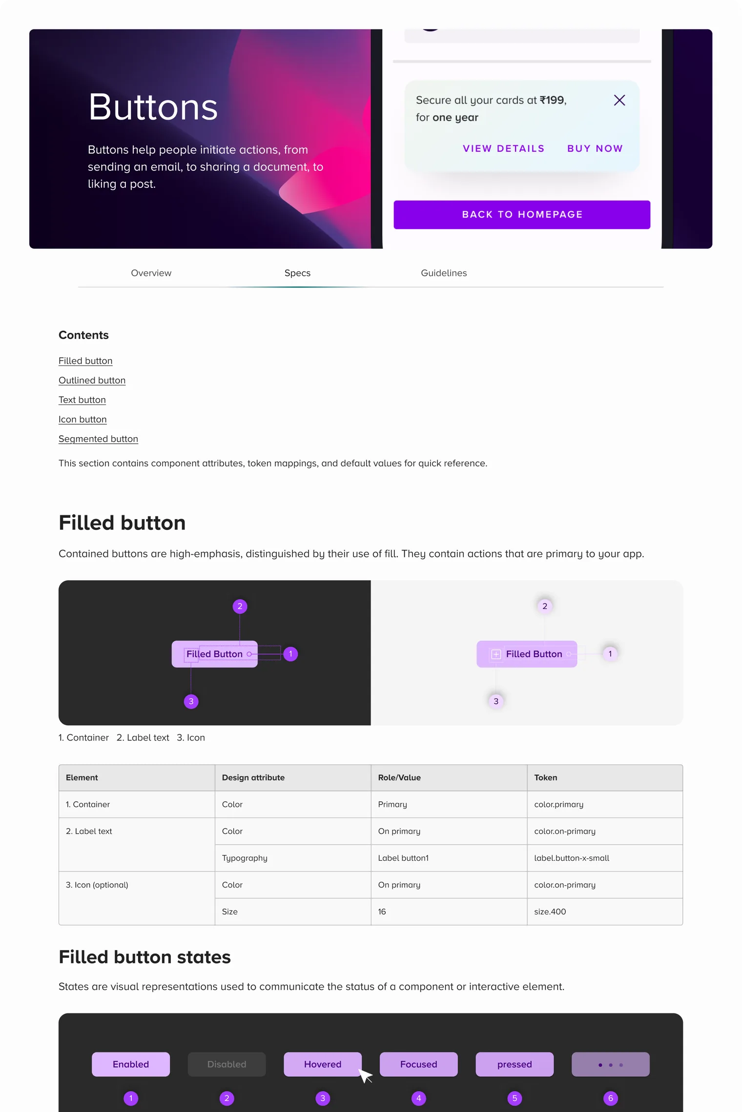
The handoff file gave each component three pages. The overview says what it is and when to use it. The specs give the anatomy, every state, and the size, padding, gap and radius as token names. The guidelines show right and wrong use side by side. In the library, each component page carried a status mark, ready or in progress, so a designer knew what was safe to build on.
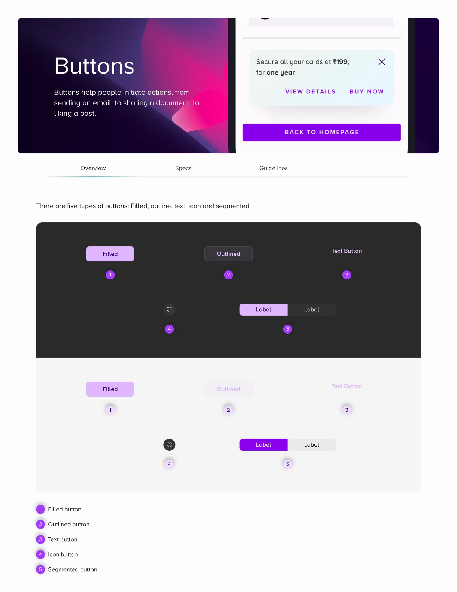
Take the button. There are five types: filled, outlined, text, icon and segmented. The filled button has six states: enabled, disabled, hovered, focused, pressed and loading, and comes in a large and a small size. Some of its rules are numbers and some are judgement. A label stays under 20 characters and never wraps to a second line. Too many buttons on one screen break the hierarchy, and the guidelines show what that looks like.
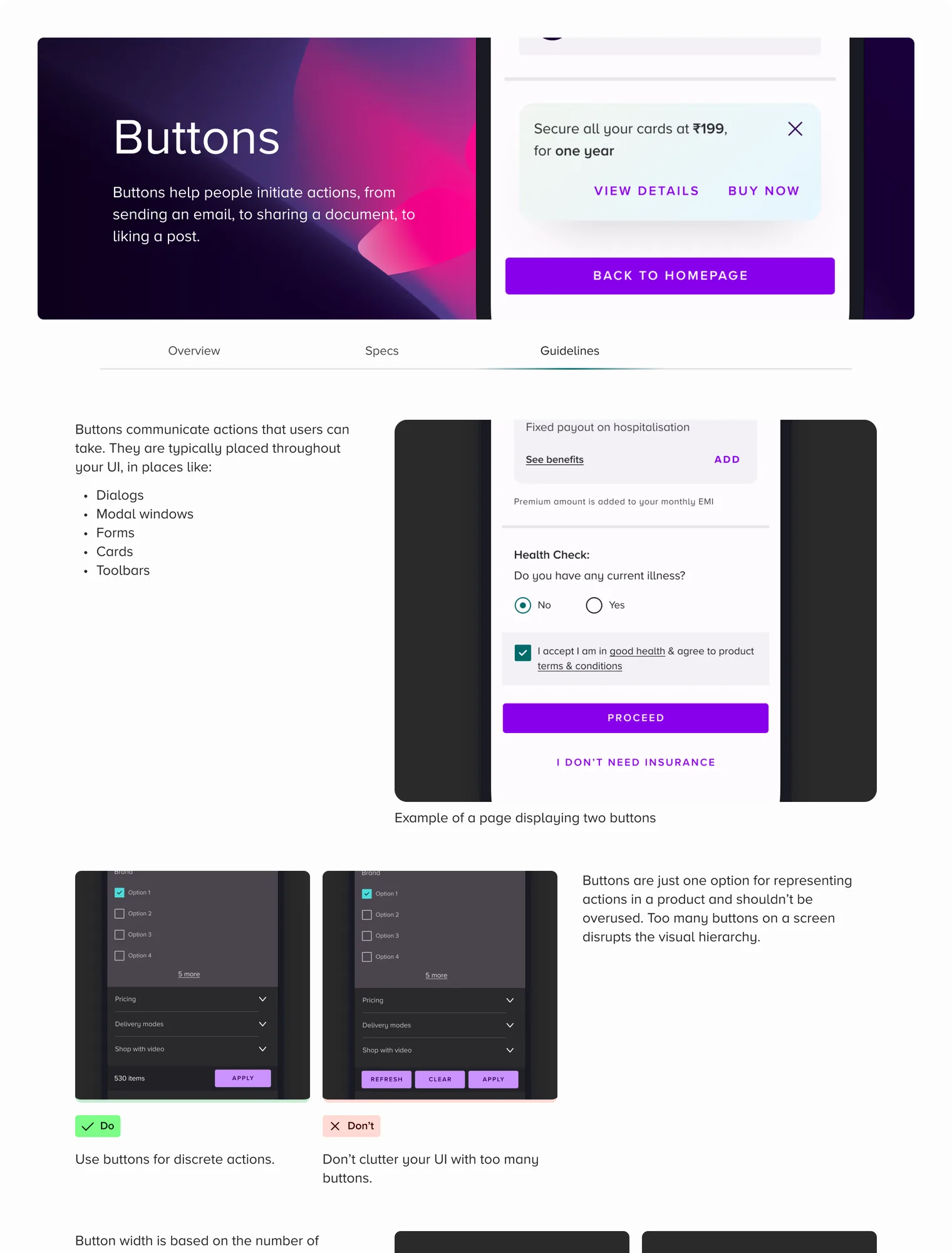

O Overview S Specs G Guidelines
- AccordionOSGOverview, Specs, Guidelines
- AlertsOSGOverview, Specs, Guidelines
- BadgesOSGOverview, Specs, Guidelines
- BannerOSGOverview, Specs, Guidelines
- Bottom sheetOSGOverview, Specs, Guidelines
- ButtonsOSGOverview, Specs, Guidelines
- CardsOSGOverview, Specs, Guidelines
- ChatbotOSGOverview, Specs, Guidelines
- Check boxOSGOverview, Specs, Guidelines
- ChipsOSGOverview, Specs, Guidelines
- Coach markOSGOverview, Specs, Guidelines
- Countdown timerOSGOverview, Specs, Guidelines
- CounterOSGOverview, Specs, Guidelines
- Date and timeOSGOverview, Specs, Guidelines
- DialogsOSGOverview, Specs, Guidelines
- DividersOSGOverview, Specs, Guidelines
- DropdownOSGOverview, Specs, Guidelines
- IconsOSGGuidelines
- Input fieldOSGOverview, Specs, Guidelines
- ListOSGOverview, Specs, Guidelines
- LoadersOSGOverview, Specs, Guidelines
- Navigation barOSGOverview, Specs, Guidelines
- Navigation drawerOSGOverview, Specs, Guidelines
- PaginationOSGOverview, Specs
- Progress indicatorsOSGOverview, Specs, Guidelines
- Radio buttonOSGOverview, Specs, Guidelines
- Search barOSGOverview, Specs, Guidelines
- ShowstopperOSGOverview, Specs, Guidelines
- SliderOSGOverview, Specs, Guidelines
- SteppersOSGOverview, Specs, Guidelines
- SwitchOSGOverview, Specs, Guidelines
- TabsOSGOverview, Specs, Guidelines
- ToastOSGOverview, Specs, Guidelines
- TooltipOSGOverview, Specs, Guidelines
- Top app barOSGOverview, Specs, Guidelines
9. Widgets and patterns
A store page in Tata Neu is a stack of widgets, and many of them were set up by merchandising teams, not designers. So the rules had to work for someone who isn't a designer.
DS 1.0 defined more than 30 widget types, more than 20 of them for merchandising: hero banners, carousels, grids, category rails, listing and personalised widgets, the NeuPass card, the payment ribbon, reviews and video. Each widget had its own spec page in the handoff file, and the stories and recipe pages had their own guidelines.
A widget rule had to be exact enough to follow without a designer in the room. The payment ribbon is a row of quick actions near the top of the homepage. With up to four icons it sits as a grid. Past four, it turns into a carousel, and the five-icon grid was removed from the library so nobody could reach for it.

Four actions: still a grid.
What it cost. Widgets are where the system met content it did not control, such as product photos with their own backgrounds. The rules had to cover that too: image backgrounds had to be a neutral colour that worked on both themes.
10. The states nobody plans
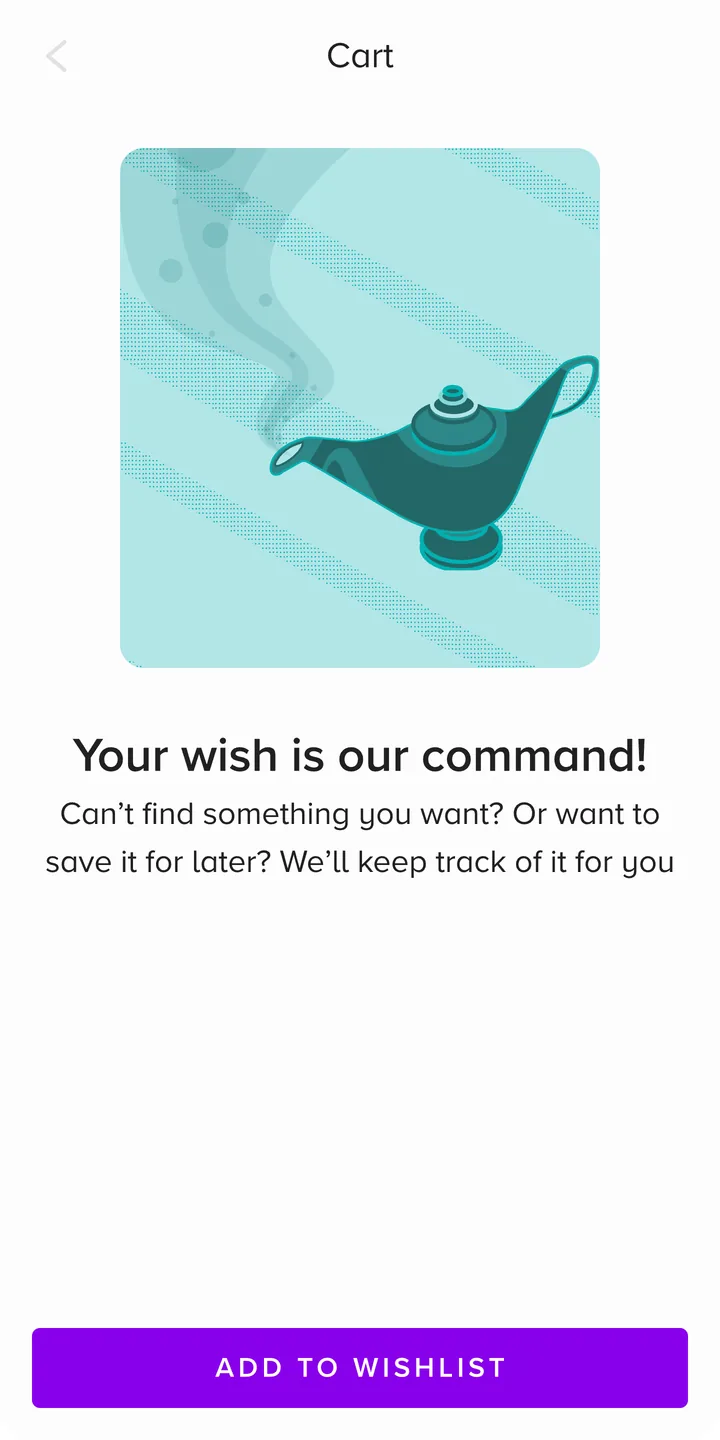
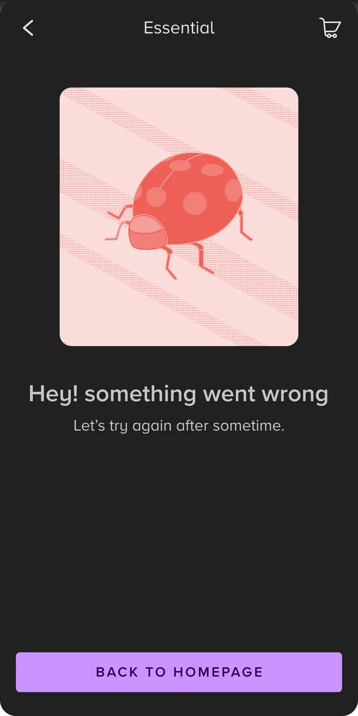
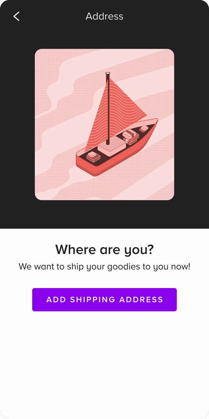
The screens a team forgets, the empty cart and the dropped connection, are where people decide whether to trust an app. The system defined them once for every module.
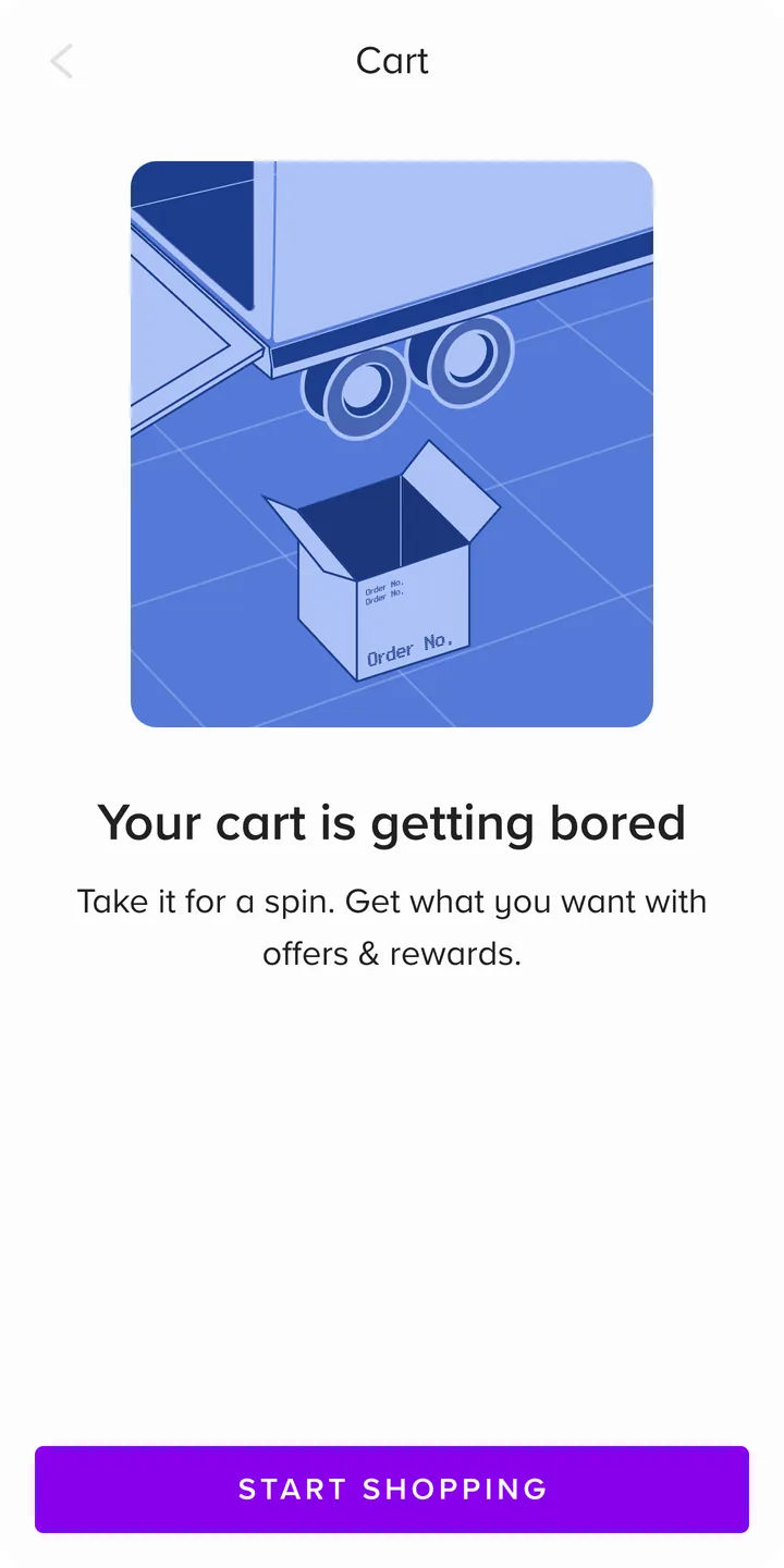
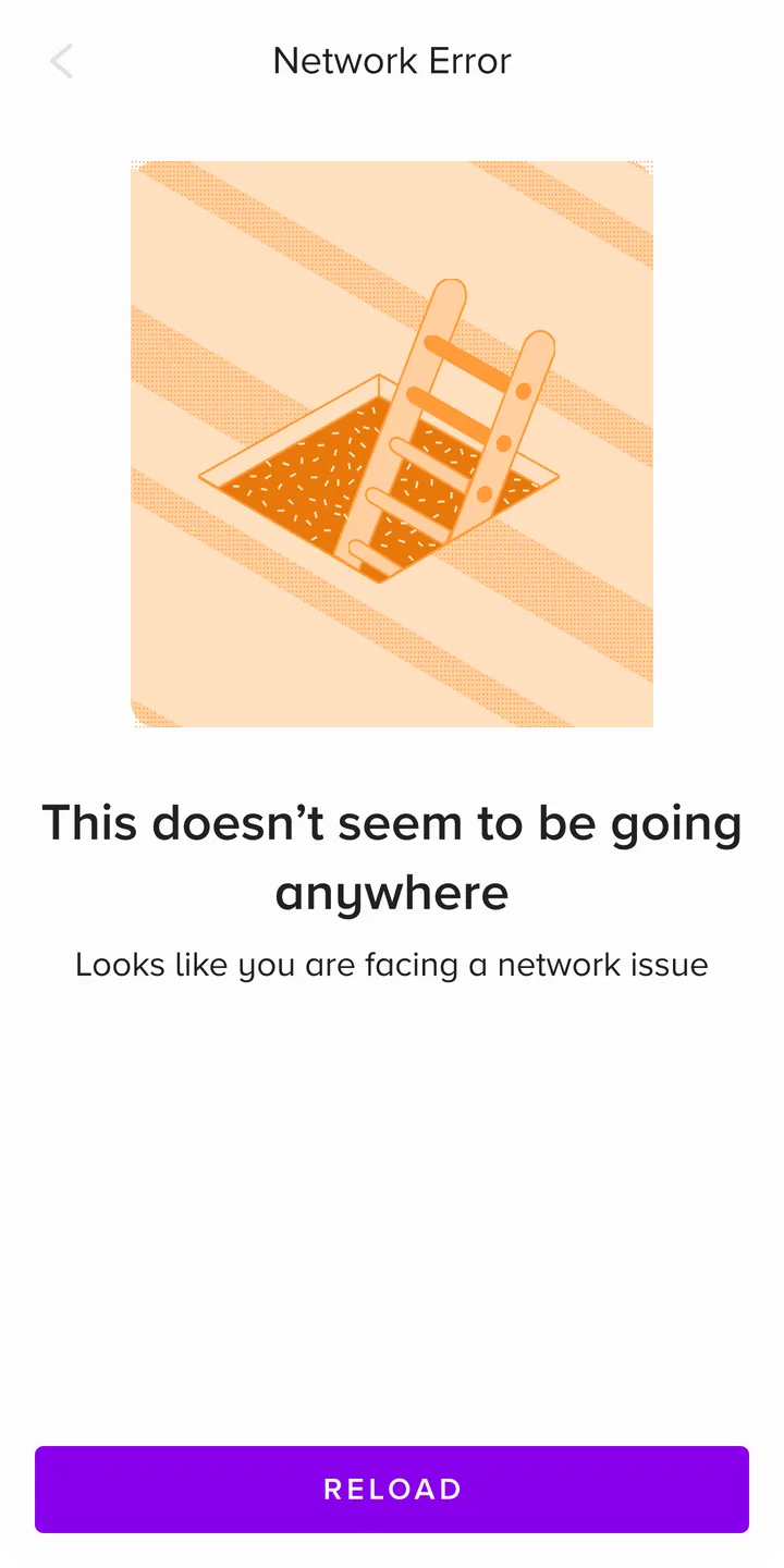
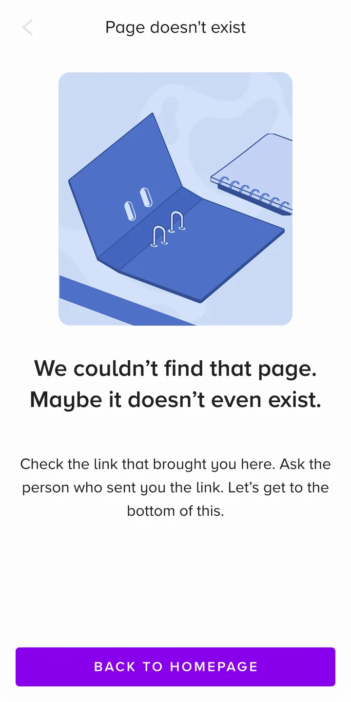
Every module needs an empty state, an error state and a loading state, and they are easy to leave until the end. So the system defined them: empty states for the cart, wishlist, bookmarks, addresses and orders; errors for a lost connection, a page that doesn't exist and a technical fault; a maintenance screen; and loaders for the moments in between.
They were written to sound like a person. An empty cart says "Your cart is getting bored". A slow connection says "Things seem to be moving... slowly", and tells you to try refreshing or find better coverage. An error is honest about whose fault it is: "We found a cute little bug. We'll take care of it."
Part IV
Making it real
Same names in design and code, written rules, and a check of every release against the build.
11. Handoff and developer parity
A developer should never have to measure a screenshot. Every value they needed arrived as a name they already had in code.
The path from design to code was short on purpose. Tokens lived in a Figma plugin and went to developers as JSON. The developers mapped them into the apps, so a role called surface was called surface in both places. Components had matching tickets in the engineering team's own design-system project, and the handoff file's specs gave every measurement as a token name.
- Figma library
Button / filled
fill: primary
- Token plugin
primary
dark   #DEB7FF
light  #8800EC
- JSON export
"primary": {
  "value": "#8800EC" }
- Android, iOS, web
color: primary
What it cost. A shared name is only half of parity. The other half is developers knowing when a name changes, and that half was weaker than I knew at the time. Chapter 17 is about that.
12. Rules others could build by
A system that lives in one designer's head stops at that designer. With a core team of two and many product teams, the system had to explain itself.
I wrote six design principles for it. They cover consistency, intuition, accessibility, writing for local content and longer words, delight, and building for the long term without debt. The one this case study keeps coming back to:
Make the experience accessible to everyone. Respect white space and lower cognitive load.
- Keep the experience consistentUse the foundations as they are, and leave the door open to innovation.
- Be intuitiveKeep things simple. Building with Neu should feel like cooking a recipe you know by heart.
- Make the experience accessible to everyoneRespect white space and lower cognitive load.
- Design with content and localisation in mindPrepare components for longer or shorter words and different sentence structures.
- Bring delight and emotion to the experienceCelebrate people's wins, and turn an inconvenience into an opportunity.
- Design for today, prepare for tomorrowLay the groundwork for a future with no UX or technical debt.
Around the principles sat the working parts. Anyone at Tata Digital could propose a new component, variant or theme, file a bug against the library or its docs, or send feedback, and the core team went through the same process as everyone else. Major changes went ahead only with everyone's agreement. In 2023 the Design Centre of Excellence gave the system a governance council: new components were presented to it, and feature designs were reviewed for the right use of the system.
A changelog recorded every token and component change, with the reason. A few lines from it:
- Removed the payment ribbon grid variant with five icons, because if there are more than four icons, the grid will transform to a carousel.
- Updated cards width from 258px to 256px for the chatbot.
- Added a new shadow token, card-shadow.
- Added a small size variant of the switch component.
- 1Product designers build on the system
- 2A new component is presented to the governance council
- 3Added to the library and documented
- 4Feature designs reviewed for the right use of the system
- 5Checked at release
What it cost. Documentation ships nothing on its own, and it drifts the moment nobody owns it. That came back to bite us.
How we knew it worked. Product designers built their features on the system and proposed new components through it, which is the hybrid model doing its job.
13. Checking the release against the build
A screen can be specified perfectly and still ship slightly wrong, and a hundred slightly wrong screens are a different product.
For release 3.5 and release 4.1 I compared the design with the build page by page, test build after test build, on the Android and iOS apps and the web app, and logged each fix exactly. On the homepage, the search bar was 36 pixels tall in the build and 40 in the design. The search icon was 20 pixels instead of 16. The top bar's background was not the gradient token the system called for. Each fix went on a dated board.
Most fixes were that small and that exact: 24 pixels after the banner before the payment strip, a 4-pixel divider, a card corner of 4 pixels, a font weight that didn't match. Some were about the system's own rules, such as a widget left in the wrong theme.

- Three icons, cart, alerts and profile, instead of one menu icon
- Logo to search gap 24 px; search bar 40 px tall, not 36; one clean corner; search icon 16 px, not 20
- Location icon 24 px, not 22
- Top bar background is the
gradient/top-app-bartoken; foreground onon-background-* - Extra space not required
How we knew it worked. The same pages were checked again on later test builds, each on its own dated board, so a fix was seen in the build, not assumed.
What it cost. Time at every release, and a system kept true partly by checking rather than by habit. The second is the real cost, and it is why the written rules mattered as much as the checks.
Part V
Change
Dark to light without stopping the app, through a planned hybrid step.
14. From dark to light, without stopping the app
The app moved from a dark theme to a light one in two steps, and the first step, a hybrid, was planned.
Tata Neu launched dark. A full switch to light in one release would have meant redesigning every module at once while they were all still shipping. So release 4.1, in late 2023, ran hybrid pages on purpose: some sections light, some dark, under rules the whole team could check.
- No more than two light widgets in a row.
- The last widget on a page, the footer widget, is always dark.
- The same widget is never used twice in a row.
- Image backgrounds are a neutral colour that works on both themes.
Because every component asked for roles, not colours, a section could switch theme by switching its mode, with nothing redrawn. The variables trial in January 2024 made it a setting on the frame. The full light theme shipped in the March 2024 refresh, on the same roles.

What a mechanical flip finds. Switch every style on the 2023 dark homepage to its light twin and two things break. The logo was a fixed white asset, so it disappears. The category labels asked for on-primary-container, which reads pale on dark and turns purple on light. A system can only flip what was named correctly, and that is why release 4.1 went light section by section, under rules, instead of overnight.

What it cost. For a few months the app had two themes on one page, which looks odd if the rules slip. That is why the hybrid rules were on every QC board, not just in the docs.
15. Rollout and adoption
The system spread first because the release required it.
The 3.5 release plan, with the Head of Design behind it, made the system the default for every redesigned module, so adoption did not depend on persuasion alone. The team introduced Design System 1.0 internally in May 2023 with a short launch film. One line from it puts the work in its place: design, architecture, product, engineering and delivery added up to one major release.
After that, every module redesign was built on the system and carried its version in its file name: the homepage, the menu, stories, NeuPass, chat, the offer zone, login, electronics and orders. A patterns layer followed in 2024. In August 2025 I led a training session for the design team, from how the system had grown to a hands-on part on handoff-ready screens.
Its use grew significantly across design and development. I can't put a number on that: the library's usage figures are shown only to its editors, and I no longer have edit access. So I describe it in words.
- Homepage
_DS 1.0 - Hamburger menu
_DS 1.0 - Stories
_DS 1.0 - NeuPass
_DS 1.0 - Chat
_DS 1.0 - Offer Zone
_DS 1.0 - Login
_DS 1.0 - Electronics
_DS 1.0 - My Orders
_DS 1.0
Part VI
Outcome
It shipped and every redesign was built on it. Then the process cracked, and I fixed it.
16. Results, honestly
It shipped, it was used, and it scaled. The rating rose too, but not because of the system alone.
- Shipped. Design System 1.0 went out in the July 2023 relaunch, and a refined version powered the March 2024 refresh, including the move to light.
- Used. Every module redesign after 1.0 was built on it, and its use grew significantly across design and development.
- Scaled. One library carried four brand modes, the web app's Desktop mode, food delivery on ONDC (India's open network for digital commerce), the omnichannel fashion module, the BigBasket integration and seasonal IPL work.
- The receipt. The July 2023 relaunch is the one where Tata Neu's Google Play rating rose from 3.8 to 4.2. Performance work shipped in the same release, so I don't credit the system alone, but I built the system behind it.
What I can't show: a usage figure, for the reason above, and a before-and-after measure of design or build speed, which I don't have.

17. What went wrong
By October 2024 the system had outgrown its process, and I wrote that review myself.
New requests arrived with no context and no form to put them in. Developers were not kept up to date. Support ran on long chat threads, and nobody could see which components were still pending. I proposed a fixed request form and one shared tracker, and the team adopted both.
What I would do differently. I would set up the request form and the tracker on day one, not two years in. When asking for a component is harder than building your own, product teams build their own.
18. What it taught me
The library was the part anyone could see. A product team decides whether to depend on a system by what happens when it needs something the system does not have yet, and before the request form, the answer was a chat thread.